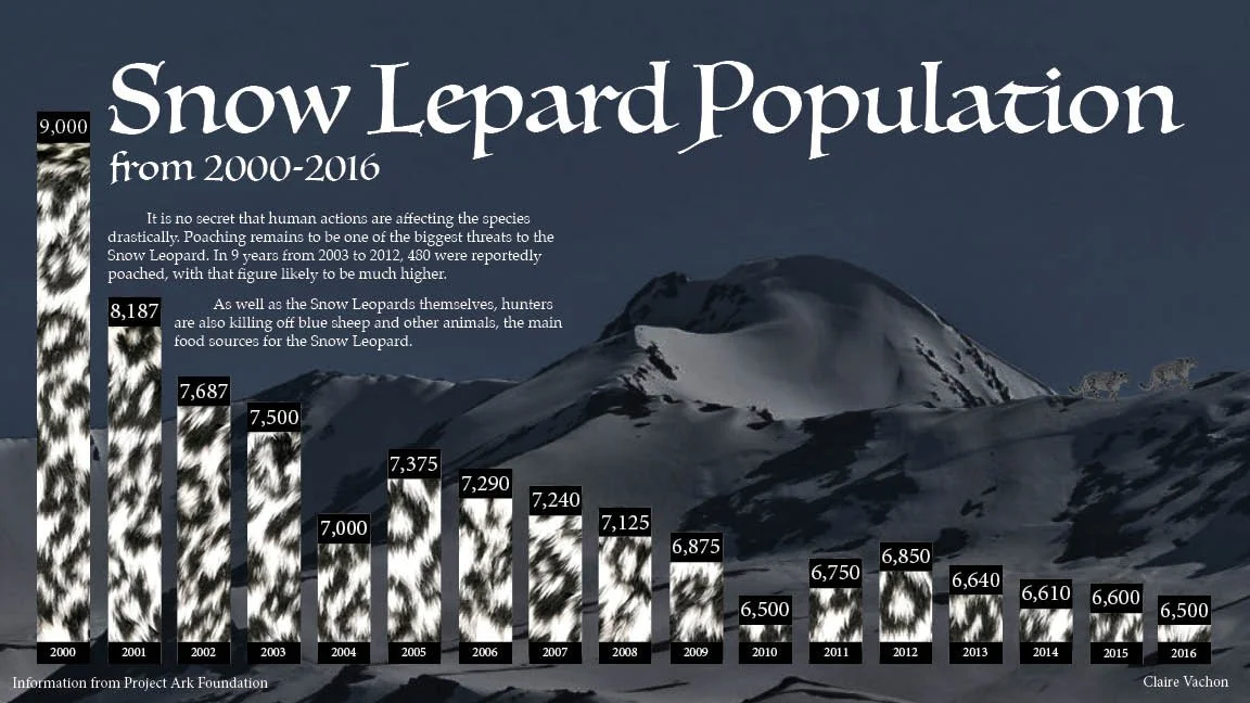
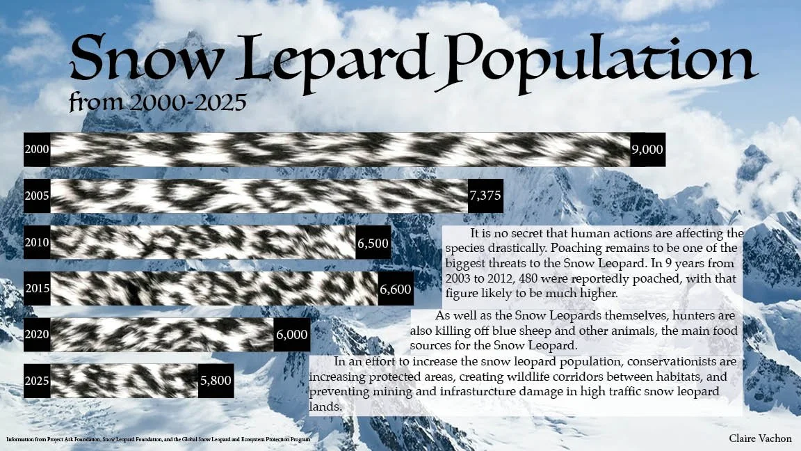
This project was fin to brainstorm, because there are so many interesting statistics I could focus on. I chose to focus on the snow leopard, because they are an endanger species that are facing a lot of trials and tribulations because of poaching, and climate change. I am a big advocate for nature, and protecting endangered species. I wanted my graph to be visually interesting, so I made the graph be the snow leopards fur. I have never seen that done before, so I wanted to try that out to make my project more engaging. I also only focused on the top part of the graph to really show the downward trend that snow leopard populations are going through. Overall I think I did pretty well, although I am struggling to gain ideas on how to make it feel complete. It feels like there is something missing.