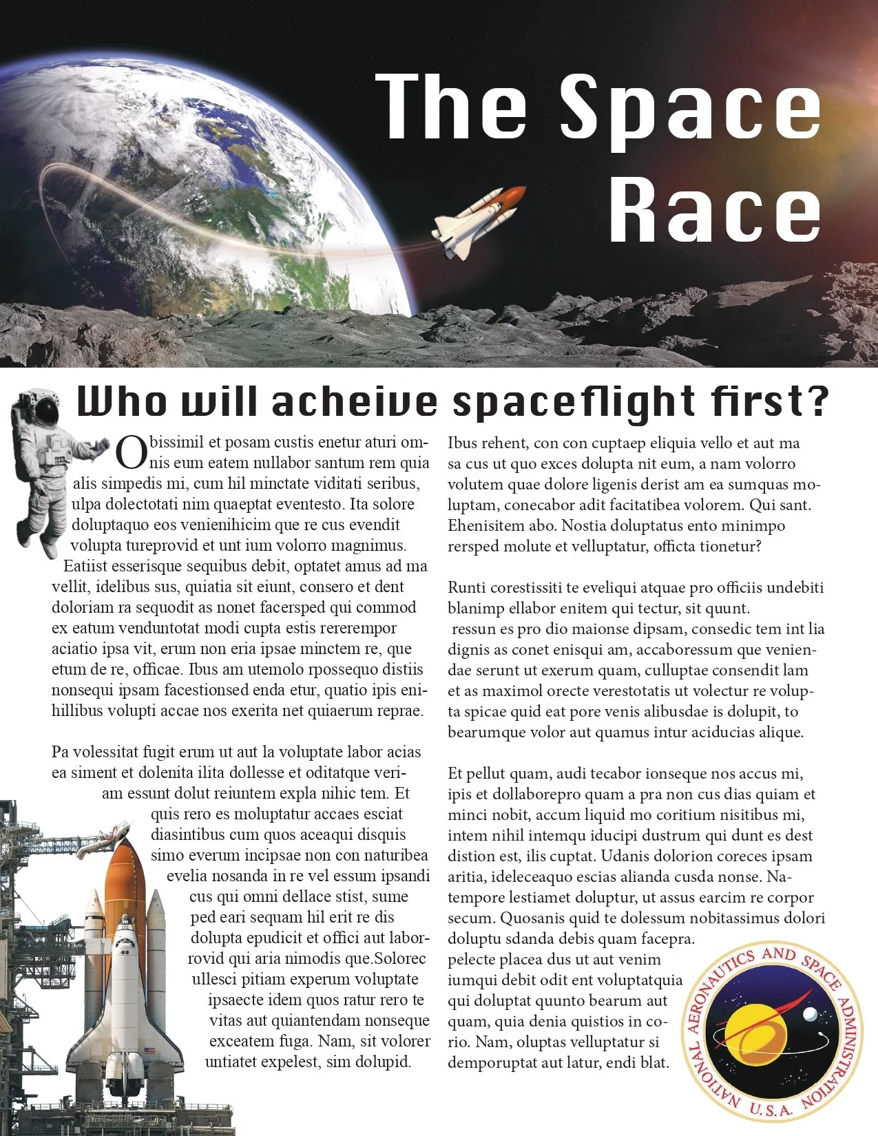
I am really proud of this design because this is the first time I have felt confident making a graphic design piece. My favorite part of this is the graphics and how they play along with the text. I wanted the space shuttle at the top to be pointing to the title so my audience will be drawn into the design. Another way I wanted to draw in the audience was by having the astronaut at the beginning pointing to the beginning of the text. I really wanted to focus on how the graphics play with text, so I had the text be molded around them. I also really like playing with pngs to see how they can be molded together. With the rocket and the trail at the top, I gathered two separate assets and made them into one thing to create a semi-realistic depiction of what a rocket launch would be like.
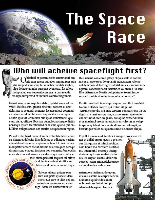
This is still the same assignment, I just switched where the space shuttle and the logo were so it would follow correct graphic guidelines with logo placement. I also made the text look more organic and less symmetrical. Yes, it is placeholder text, but I wanted it to read like its a real article. Overall I am very happy with this assignment final, and I believe that it is my best work from this class.