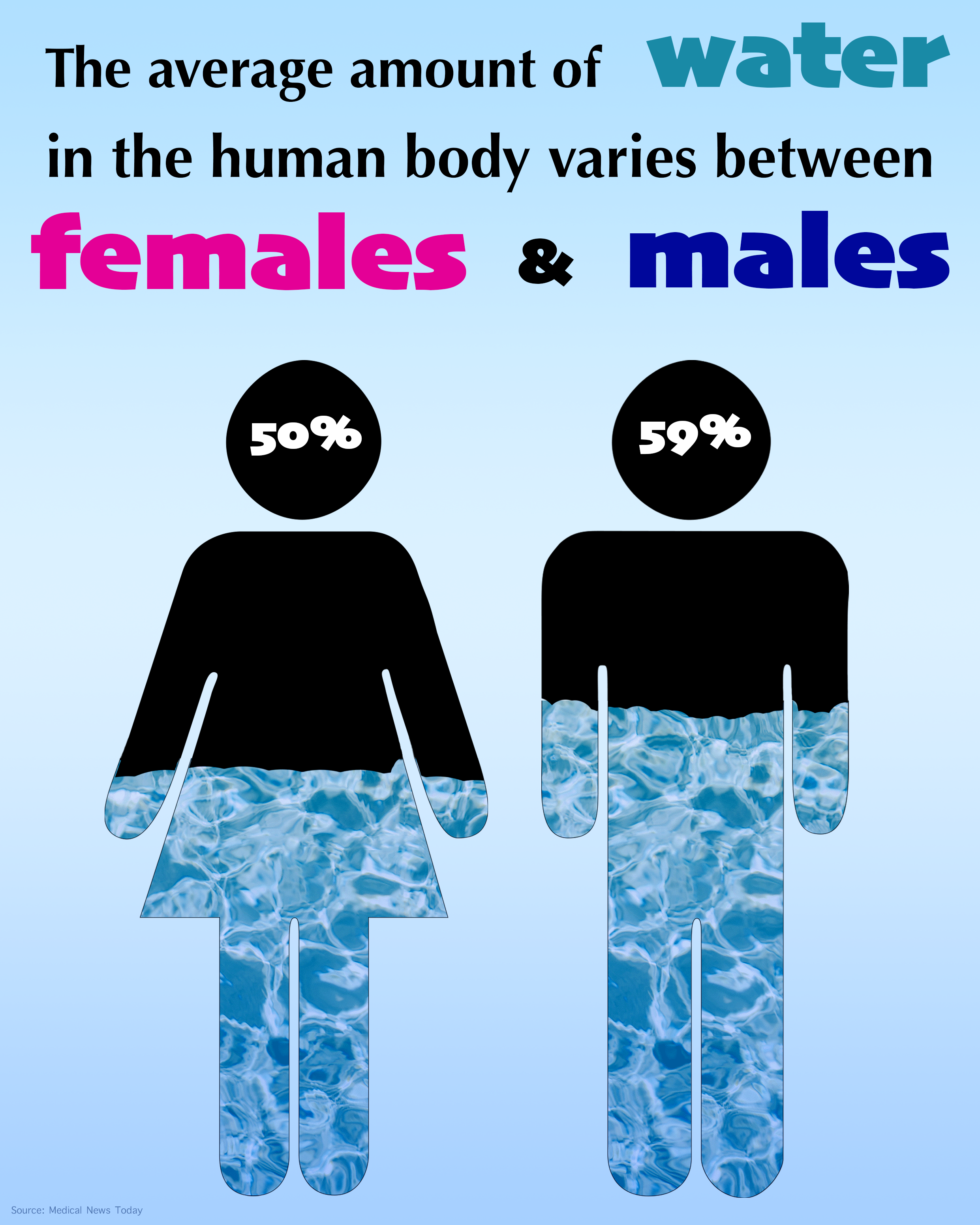
This piece I really wanted to focus on the water content within the graphics of the man and woman. I experimented with layers, and blending modes to make it feel like the person was actually filled with water. I also wanted to keep this design relatively simple so there wouldn’t be much visual noise. Having simple designs allows my fact to come across easier without the audience searching for the meaning of the graphic. I also played with the color of the text to create a path for the audience to follow with their eyes. Having different colors and sizes with text allow for some variety within the graphic so it won’t be a boring block of text within an already simple graphic.
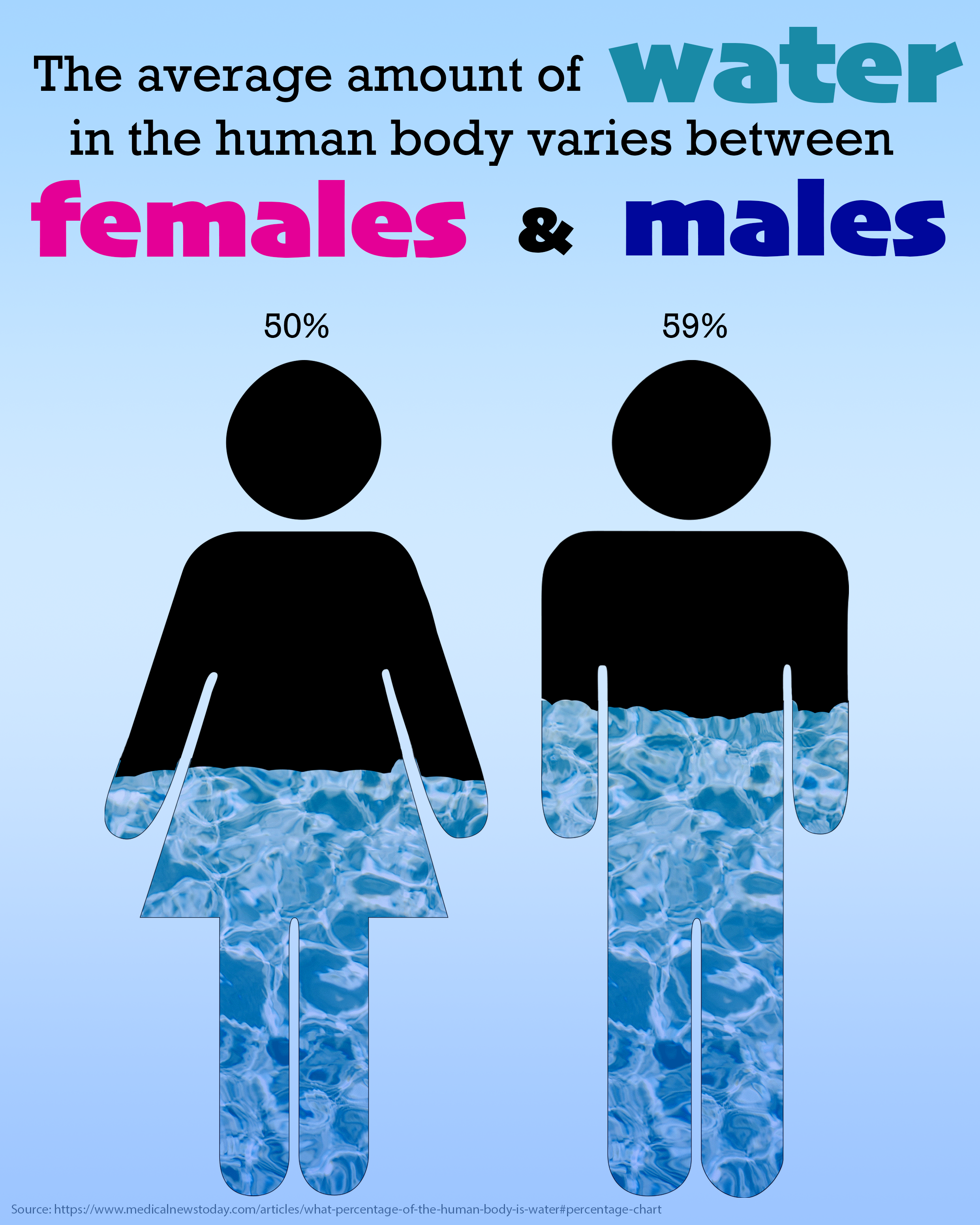
I redid this assignment to make everything feel a little more professional and less elementary. Small changes like moving where the percentages, arranging the type so it wasn’t centered, and making the source at the bottom more legible and smaller. I think this design would be something you see in a doctors office of some sort, maybe a pediatric doctors office because it has that childlike look to it. Overall I think this assignment went pretty well. I learned a lot about layering and blending modes along with how to make type match the aesthetic you are going for. It was a learning experience for sure.