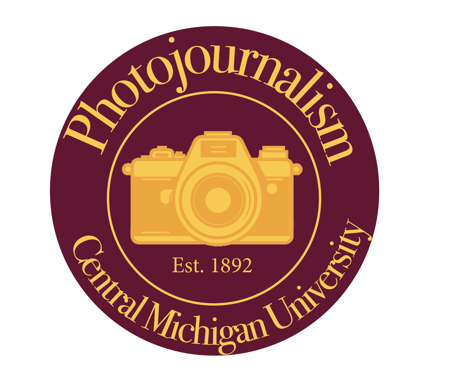
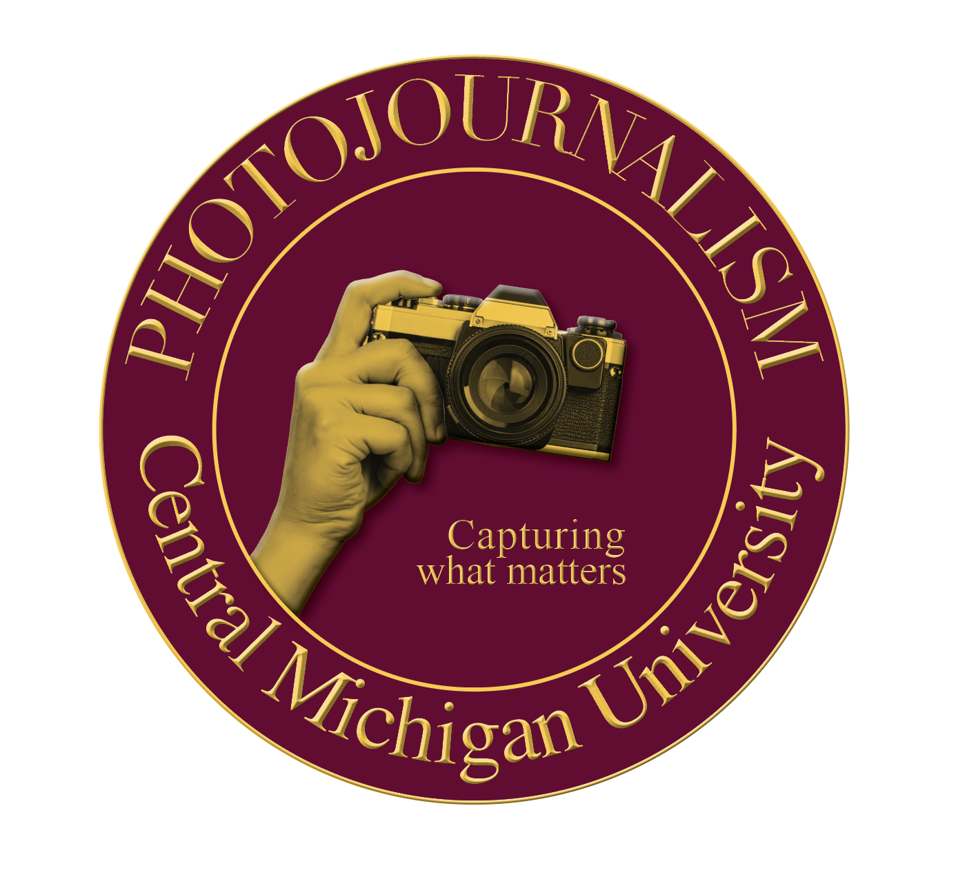
For this assignment, we were tasked with making a logo for CMU in some way. We learned about RGB and CMYK colors and the differences between them. We inputed the correct CMU colors into InDesign so we could create 4 different logos from scratch. I had a lot of fun with this one. I started with the artist choice because I felt like I could do whatever I wanted without feeling like I needed to be tied down to a certain style. As I got into it, I kind of lost steam a bit and things became a little less creative. Overall I think my favorites are the artist choice, and the first text focused logo. I really wanted to emphasize the camera with both of those logos, so I added the graphics of the shutter in the Os and the hand holding the camera in the other.

Text focused
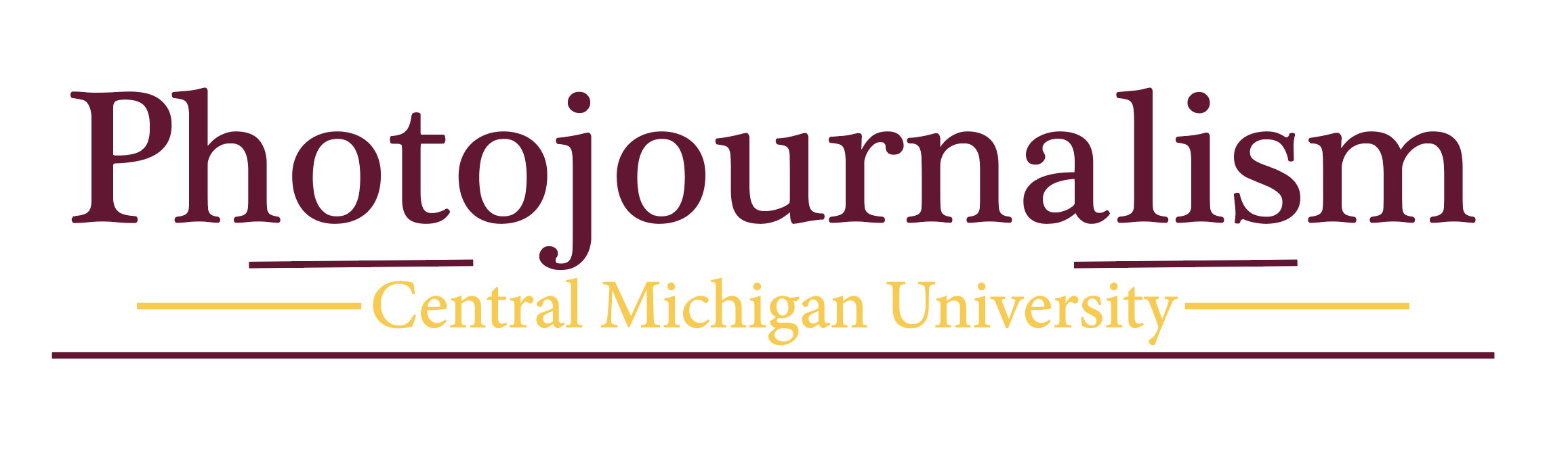
Text focused
Graphic focused
Artist choice